While in Switzerland I had the good fortune of experiencing peak fall color. Along the way i decided to experiment and really liked how this particular photo came out. This is a straight photo with only a little bump given to the natural colors of the scene. What originally attracted me to the subject in the first place was the color and while I took standard photos of the scene I found this rendering of it captivating.
What are your thoughts on this experiment?
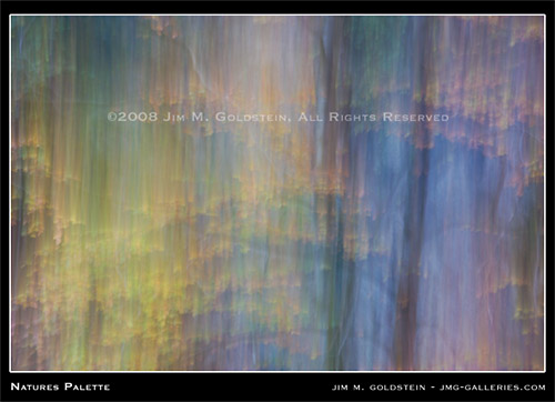
[tags]abstract, photography, nature, color, fall color, fine art[/tags]
Well, personally I love it, Jim….
But then I am prejudiced…
As I just did the same type of image
with the Gorgeous Golden Black Oaks in Yosemite
this last Sunday, and a few other stops along
the way… so also got many colors 😉
Led a group there for the Fall colors.
Guess the Inspirational juices were flowing
all over the world …
Glad to know we think alike….
Happy Fall to you….
I think it is an awesome image, I just love it!
Dear William Neill: This is a very nice photo.
🙂
@Nelcha Thanks. When your photo is out point me to it. I’d love to see it.
–
@Mark Thanks. It’s great to get the feedback… particularly when its so glowing.
–
@Garry Argh! There could be worse comparisons. William’s work is great. I suppose I’m a little more focused on the color study as opposed to the general inspiration of the technique. It’s all good.
Jim:
Of course it’s all good. On my last book project, I specifically thought of Bill Neill’s work, and it got me to lift my camera and think in a new direction. The inspiration gets credit for the first step. Where we go from there marks our own path.
And considering the comparison was at the very top of the list, any *other* comparison would be worse.
Cheers.
Jim,
I love the color palette! The movement made me look twice. At first glance it looked like you shot the image through a waterfall. Great shot.
I want to be compared to William Neill too! 🙂 Great image Jim. I thought it was a water reflection when I saw it on my phone earlier.
Excellent image Jim. It is one of those images that reveals something new every time you study it. Are you going to share the details of how your experiment was created – or taking that ol’ artist high road and let it be for what it is. 🙂
It is very nice. I find I am continuously scanning the photo to see something new. It is great.
The coloras are very balanced. It’s very organic. I like it.