Having covered the basics of watermarks and why they’re important to use in my earlier post My Journey With Photographic Watermarks, I wanted to take you on a journey of how I’ve employed watermarks over the past 10 years. Not only do I plan on digging my old watermarks out of my archive I’ll tell you what I was thinking when I used them and why I decided to change them.
As previously discussed watermarks by definition are ugly, but a sad necessity. As I’ve dug up my old watermarked images I’ve shaken my head more than once in disgust. Disgust because 1) the intent of my photography has been to show beauty and dynamic moments not a watermark and 2) because as I go back in time I realize how horrible some of my watermarks were.
Attribution AND Branding
I have an extensive marketing background and as such learned early on the importance of “Brand”. Most of the time you never think of brands or branding and thats because over time with repeated exposure brand identity becomes subconscious, as an example a Coca Cola bottle. From the very beginning of my online image sharing efforts brand was a central consideration as much as attribution. Clearly watermarks are critical in providing credit for creative work where credit it is due, but it also provides an opportunity to give viewers something to recognize beyond photographic style… in essence a digital signature. This no doubt will rub fine art photographers the wrong way. For fine art photographers the brand is the work, the style and the vision. I don’t disagree with this, but as an artist no opportunity should go unturned in creating an identifiable brand both for prospective sales and commissioned work. Looking past a watermark as an aspect to communicate ones brand would be a wasted opportunity.

Jim M. Goldstein Photography Watermark circa 2000-2001
My 2000-2001 photography watermark (above) didn’t last very long as I quickly learned the importance of including a standard copyright statement “©<year> Jim M. Goldstein, All Rights Reserved”. I have to admit I don’t mind this watermark from a style perspective, but it wasn’t enough. The downside was that it wasn’t always clear with a busy background, should have been larger and as discussed missed the standard copyright statement.
Watermark as a Calling Card
Beyond legal statements and providing reason enough to use cool looking fonts, a watermark has the ability to provide a key marketing function… be a calling card. In 1997 Hotmail was sold to Microsoft for $400 million dollars. The reason was the large audience that had been developed. How did Hotmail cultivate rapid user growth? Through “viral marketing” which at the time was a brand new term. Every email sent from Hotmail included their tagline and a URL back to their service home page. These days we take such basic marketing for granted, in fact we’ve learned to filter it as noise. This isn’t always the case though particularly when you’ve relayed something to a viewer that is much more engaging such as photography. While Hotmail proved the concept we’ve later seen YouTube perfect it. At the time YouTube was sold to Google every video had 7 ways it could be sent to someone to be seen. I’m not out to delude you that photographic sales are in the same league as online email or video sharing, but the marketing concepts are applicable. Beyond traditional attribution as to who created the photo a watermark can also be used to point people to a destination to see more work they might enjoy and perhaps even purchase.

Jim M. Goldstein Photography Watermark circa 2001 for Downloads
In 2001 I decided to experiment and botch the “calling card” or “viral marketing” concept. I released a more intrusive watermark for wallpaper I was making available for sale. Granted I was very wet behind the ears as were most photographers placing work online at the time, but this watermark was just hideous. Looking back I’m glad I faulted on the side of hideousness rather than going too light on my watermark. You don’t have to be a rocket scientist to know that my wallpaper sales never took off. My late 2001 watermark clearly lacked an artistic touch and was far too distracting. What it did do right is provide the standard copyright statement along with my site name and URL. In 2001 my web site was brand new, I knew that people were hot-linking or lifting photographs if they liked them and I wanted to get people back to my web site.
Learning from my previous mistake, that fortunately not many people saw (until now), I released an alternate version for general web viewing (see below). While it was more artful and less intrusive at the time it still rubbed people the wrong way. I stuck with it for a couple of years despite the feedback I received.

Jim M. Goldstein Photography Watermark circa 2001-2003
Know Your Audience
While the safest assumption to make is that once your photography is online it will be distributed beyond your control and in ways you may never know, there are instances where you need to tailor your presentation (watermark included) to your audience. Not every online audience is going to be uneducated in the ways of copyrights and pirate your photographic work. When I found a small photography forum full of great people that I recognized and respected I scaled back my watermark to the standard copyright statement. I also used the scaled back watermark for an online portfolio site I was using knowing that most viewing my work there would understand the implications of pirating my work.

Jim M. Goldstein Photography Watermark circa 2003
In some regard this watermark worked just fine for the audience, but it was a step backwards as it related to branding. This basic watermark (magnified so you can see it) was adequate, but was too faint.
Framed Photos
The first time I saw a framed photo online was I was baffled. I felt that the photo should speak for itself. Why rely on a frame? It just seemed cheesy. Over time it grew on me and I could see how attribution, branding and artistic presentation could be blended with it. I have to give credit to fellow photographer Patrick Di Fruscia who I first saw with a framed photo online (note he just launched a blog) as it proved to be an influence… in a way I’d never have predicted. Still for many this approach doesn’t sit well, but it has proven to be popular with a growing number of viewers and photographers.

Jim M. Goldstein Photography Watermark circa 2003-2009
What I’ve grown to like about this approach is the ability to provide a photo title, my name and web site URL in conjunction with a standard copyright statement. The downside to this is that it is rather busy. To be blunt though any watermark style is going to be distracting if your photography isn’t strong and lacks impact. A strong and engaging photo will keep a viewers eye no matter what the watermark.
No Watermark is Perfect
2008 proved to be one of my best years photographically speaking, but it was also a frustrating year. With success came copyright infringers and a lot of aggravation. It is essential that you make your copyright statement visible, so that an infringer cannot say they didn’t see a photo was copyright protected. This is not just preference, but a matter of law in the event you go after someone in a court of law (at least in the U.S.) As noted earlier, my preference is no watermark at all. I want my photographs to be front and center, but would you believe I had someone infringe my work in the watermark format exemplified above in the frame and they claimed they were unaware the image was copyright protected? I was told my watermark was not obvious enough yet they removed my over image watermark and cropped away the frame. Below is the infringed version of the photo in question as well as how the original was displayed on Flickr (where the infringer found my work).
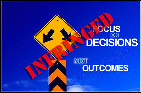 |
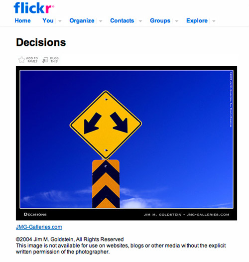 |
| Click to Enlarge | Click to Enlarge |
After this instance of copyright infringement I started overlaying an even larger text watermark over my photos in this framed format (see below).

Jim M. Goldstein Photography Watermark circa 2008-2009
Reinvent the Wheel
After being frustrated by the amount of infringement of my photography in 2008 I decided to re-evaluate my watermarking approach. I wanted to learn from past experiences, simplify the effort it took to watermark my photography, utilize the latest tools available to me and develop a watermark design that was refined. In late 2008 I finalized a new watermark design that encapsulated a large copyright symbol, my name and my web site address. In essence blending efforts with attribution, establishing a calling card, clearly identifying legal protections and branding with in a limited footprint.

Jim M. Goldstein Photography Watermark circa 2009
Weighing Watermarks
Everyone has their limit and one can only go so far to ruin their photography online under the guise of attribution, branding and limiting infringement. For some my evolution may be a spiral into madness or just bad taste. Everyones pain threshold in this area is different, but one always has to be true to themselves. A watermark should be practical, functional and aesthetically pleasing to the photographer. Watermarks are not one size fits all… by that I mean every photographer has a slightly different expectation to the purpose and outcome of placing their photography online. Ones watermark should be tailored to a specific expectation and purpose. A stock photographer may have a very different watermarking strategy compared to a strict fine art photographer. The best way to move forward with watermarks is to align an approach that meets your online marketing needs and to adapt. Things never stay the same for long, but bad user behavior certainly seems to persist in one form or fashion. With that being said in my next post I’ll explore “Marketing Through Infringed Photos with Watermarks“.
[tags]Photography, Copyright, Watermark, Watermarking[/tags]
Pingback: Watermarks: My Journey With Photographic Watermarks | JMG-Galleries - Jim M. Goldstein Photography: travel, landscape, and nature pictures - stock photos and fine art prints
Hey Jim,
Really enjoying this series as I’ve been evaluating my watermarking process and procedure lately.
I’m not sure if you are planning on covering it, but I’d be really be interested in how/if you go about looking for infringements of your photographs. Obviously if you are watermarking your photos as heavily as you are, it’s probably unnecessary, but I thought I’d ask.
Thanks,
Justin
Hi Jim, really enjoyed that. I also would be interested in how you have been handling your infringements. I didn’t know it was such a problem. I’m also interested in which program you use for watermarking, if not just on photoshop itself.
Thanks
Chris
Jim,
Thanks for sharing this information.
Thanks. I’ve recently had a few issues with some copyright infringement and I’m having to re-evaluate my watermarking practices.
This is a great series Jim and very ‘brave’ to show your earlier watermarks 😉
I am going to update my own watermark to be more detailed in the copyright text – thanks for sharing your thoughts so freely.
Going slightly off topic, do you use any tools to search for copyright infringement?
Jim, thanks for posting this. It’s a very interesting walk through the evolution of your watermarking. I have a love/hate relationship with watermarking, too, and I’m still trying to find a balance I can be happy with.
Jim, could I copy your watermark style? Would that be infringing on your anti-infringement symbol? I really like the idea. I use the watermark on smugmug for my galleries, but I’m thinking of a manual one on some other specific shots. Thanks.
Pingback: Marketing Through Infringed Photos with Watermarks | JMG-Galleries - Jim M. Goldstein Photography: travel, landscape, and nature pictures - stock photos and fine art prints
Very interesting series so far. It’s interesting to see that I’m going down nearly the same exact road on watermarks. Pretty soon I’ll be back to the big ugly symbol over key parts of the photo I’m sure.
Thanks for taking the time to document your history with watermarks, in multiple articles even. I, too, have progressed through a similar path. I have had a handful of people complain to me about my watermark “ruining the photo.” Ironically, these have been the very same people that wanted to use my work without attribution or compensation. Thus, the purpose of the watermark was served.
Photoshop actions have been invaluable in my watermarking process. I am able to stamp hundreds of photos by the simple click of a couple of buttons.
bcj.
Jim,
I too have had a watermarking journey, driven by the outside world starting to notice my pictures via Flickr.
I started with a plain white text label bottom left of the picture, but this looked untidy, so I moved to a 50% opaque black footer with white text on it, but then I realised it was far too easy to crop the bottom 20 pixels out of a large image.
So now, I restrict Flickr uploads to max 1024px in any dimension, and both drop a footer with the copyright notice clear in white on semi-opaque black, and I stamp the copyright message in 10% opaque right across the middle (thank you PS action droplets from LR!).
This still feels like a compromise, in that I’m often ‘defacing’ the most interesting parts of a picture, but that’s where you’ve got to protect yourself from croppers…
Unfortunately, I don’t see what else there is to do if we’re to display our photos on the web?
Pingback: Link Roundup 02-28-2009
Here are some answers I have been looking for. Enjoying your series and your work. Teri
Great series Jim, thanks for all the time and effort to put this together! I have been a strong believer in watermarking all my images displayed online since I started displaying them online. This was only reinforced for me recently when I saw a Fortune 500 CEO give a presentation which included a clearly watermarked image…
One thing to note, I noticed how up until your current watermark, you usually included the copyright date along with the copyright notice. Now you dropped the date. I’m assuming this is because when dealing with stock having the date in the watermark can artificially “date” the photo (a buyer might be turned off by knowing that the image is X years old…).
Curious if this is the reason you dropped the year or something else?
@Jim Poor Its an unfortunate aspect of posting images online. Ultimately the size and tact of a watermark is reflective of the photographers comfort level with having their work online. But ultimately… no risk, no reward.
–
@bcj. Lightroom and Photoshop have a couple of great mechanisms to make this easy. More on that soon.
–
@Chris Brown 1024px is large. I had been posting images no larger than 800px and now I’ve restricted the size of my current work to 500px. I’ve opted to do this because resize engines on Flickr and elsewhere will remove the metadata I embed. A 500px image doesn’t need to be resized for most photo sites. Something to consider beyond the watermark dilemma.
–
@Teri Glad the article has been helpful.
–
@latoga Actually it is more of a style versus function decision. The date really doesn’t hurt or help stock photos… as far as I can tell. I think the best practice is to include the year, but the most important aspect of a watermark is to inform an infringer they’re messing with protected work. A big copyright symbol does that nicely. Over the years I’ve not found detailed debate on including the year or not and I don’t believe it weakens an infringement claim by not having it. Of course all of this is just hot air if you haven’t registered your photos with the Library of Congress to perfect your copyright.
Interesting article!
I try to use watermarks also, but sometimes have trouble choosing a site/url to use since I have several 😉 At the moment I have it in the corner, transparent. Thinking about making it more visible. I rather have a watermark and post large enough picture to enjoy it rather then make it very small.
Hi Jim,
Sorry if this is a dumb question, but how did you design your watermark? Did you create it in photoshop, illustrator, or using something else? (wondering if it is a raster or vector image)
Thanks,
Rich
Thanks for the information Jim. A bought a batch watermark creator, but have vacillated on adding watermarks to my image. I have become more conscious, and concerned, about this issue since taking my site and blog live in the last month or so.
Best,
Matthew
I have a very contentious relationship with watermarking. My 3D artwork is designed specifically to be used as computer wallpaper, so I have to keep my watermark as innocuous as possible.
This unfortunately leads to copyright infringment, but it is as small price to pay for more people using your work.
Great post, BTW. I will have to read more.
Really interesting article and not only this one. Thanks for sharing your views and experiences with others !! Looking forward to read some more.
Lucie Debelkova
http://www.luciedebelkova.com
http://www.facebook.com/lucie.debelkova.photography
gplus.to/luciephotography
Glad it was of help Lucie. Thanks for the comment.
I’m not into professional Photography. However, I am into History and owned an advertising company many years ago. At that time Photoshop was not even thought of. We were in the dark room with all the chemicals. Very often the only copies if historic photos come from Libraries where most photos are in the public domane realm. All be it, any photo that has been half toned is almost impossible to use if you are particular about what goes into your finished work. With the latest technology of Photoshop does anyone know of a partial area of half toning that would make certain areas look very bad when copied?
My view is that history is worthless unless it is shared. However, any photos that I own I would like not to see the next day on Ebay for sale.
Ward
http://www.lowarearick@gmail.com